After many months of tinkering after work, The Conservatory is finally “done”. I’m sure there’s more I could do with it, and I might go back and tweak a few things here and there, but to save my own sanity I probably need to just put it down and take a break before my next project. You need to download VRChat to see it, available for free on Steam or the Oculus Store.
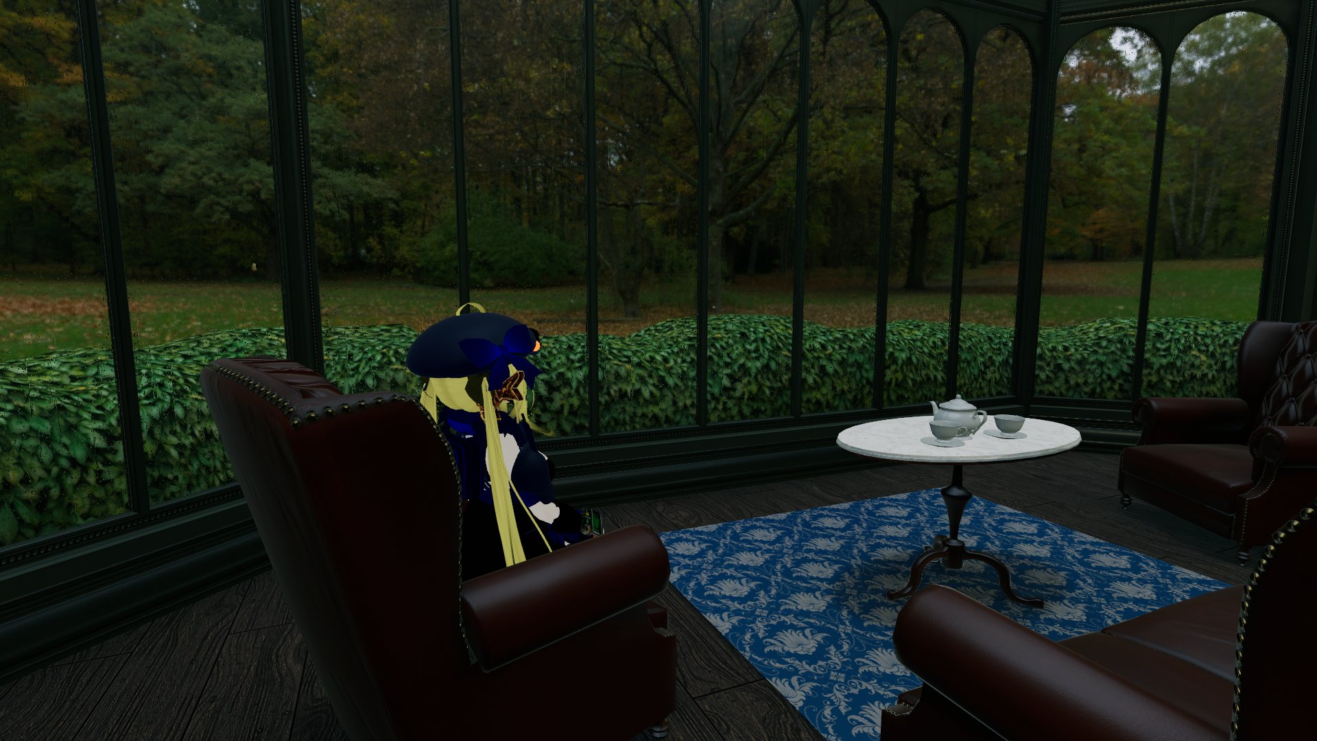
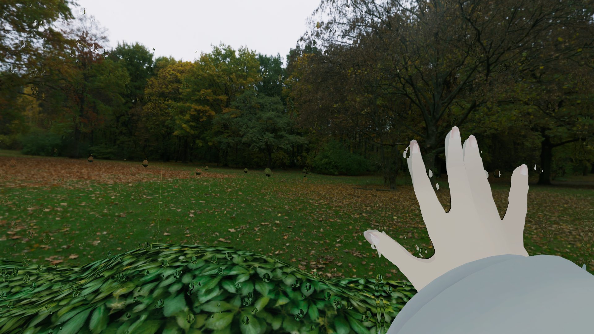
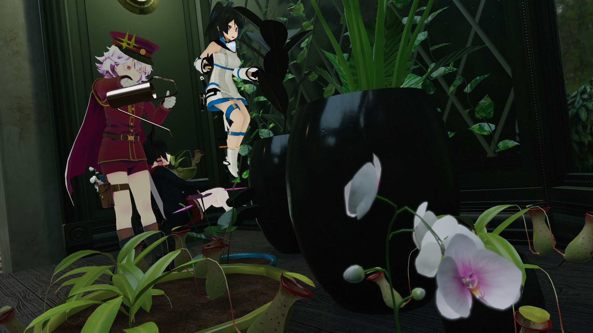
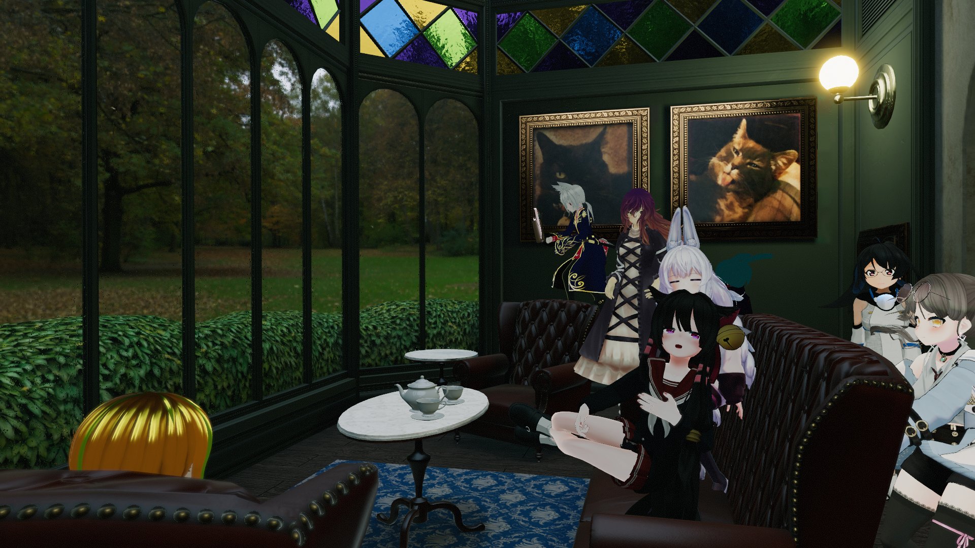
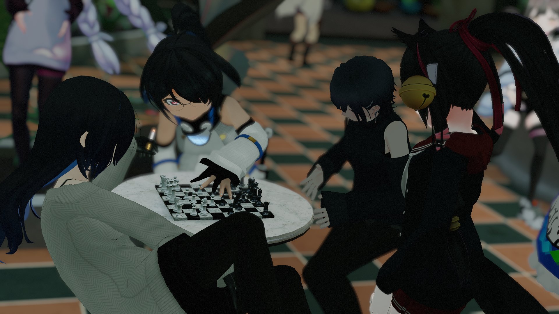
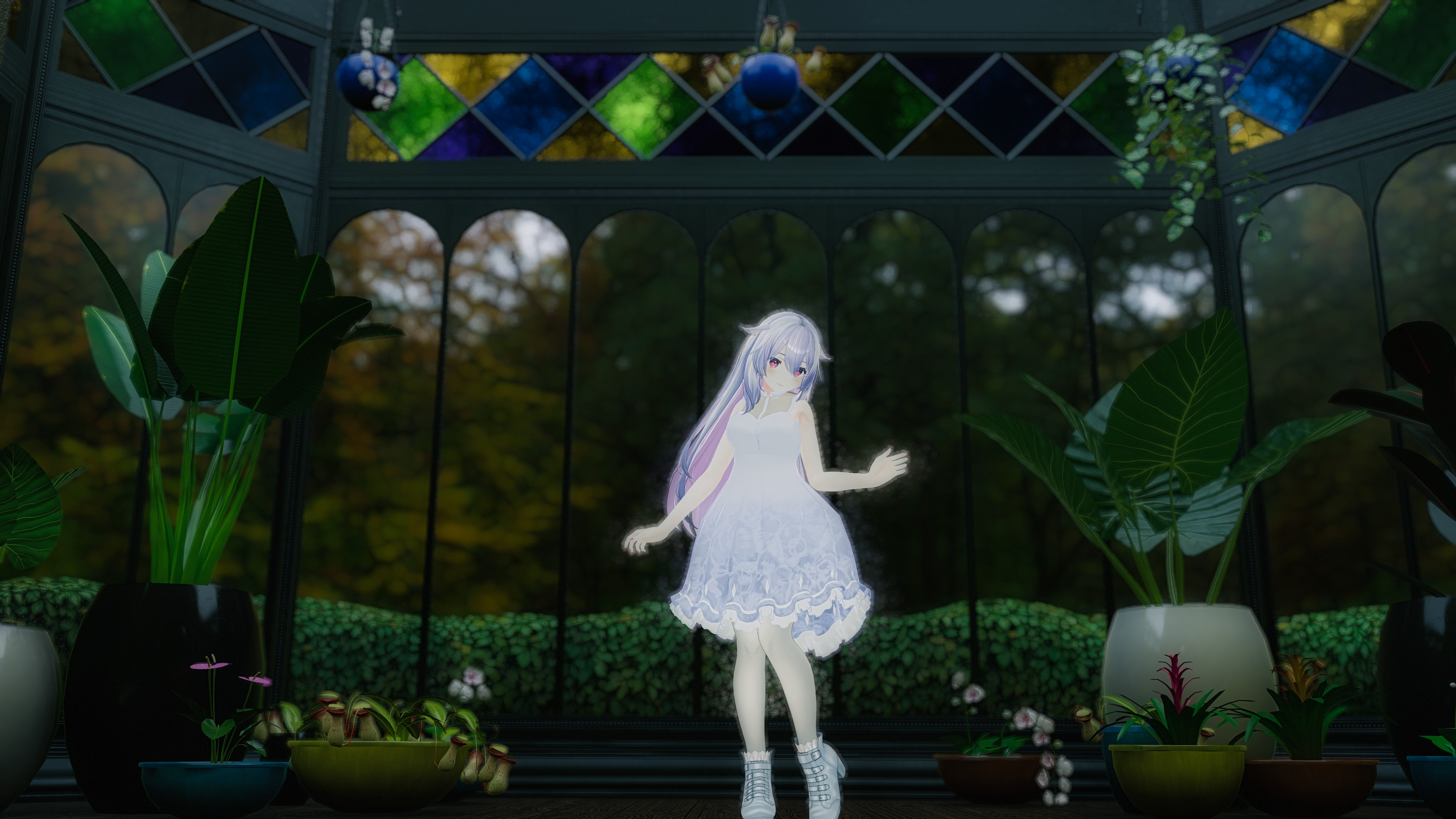
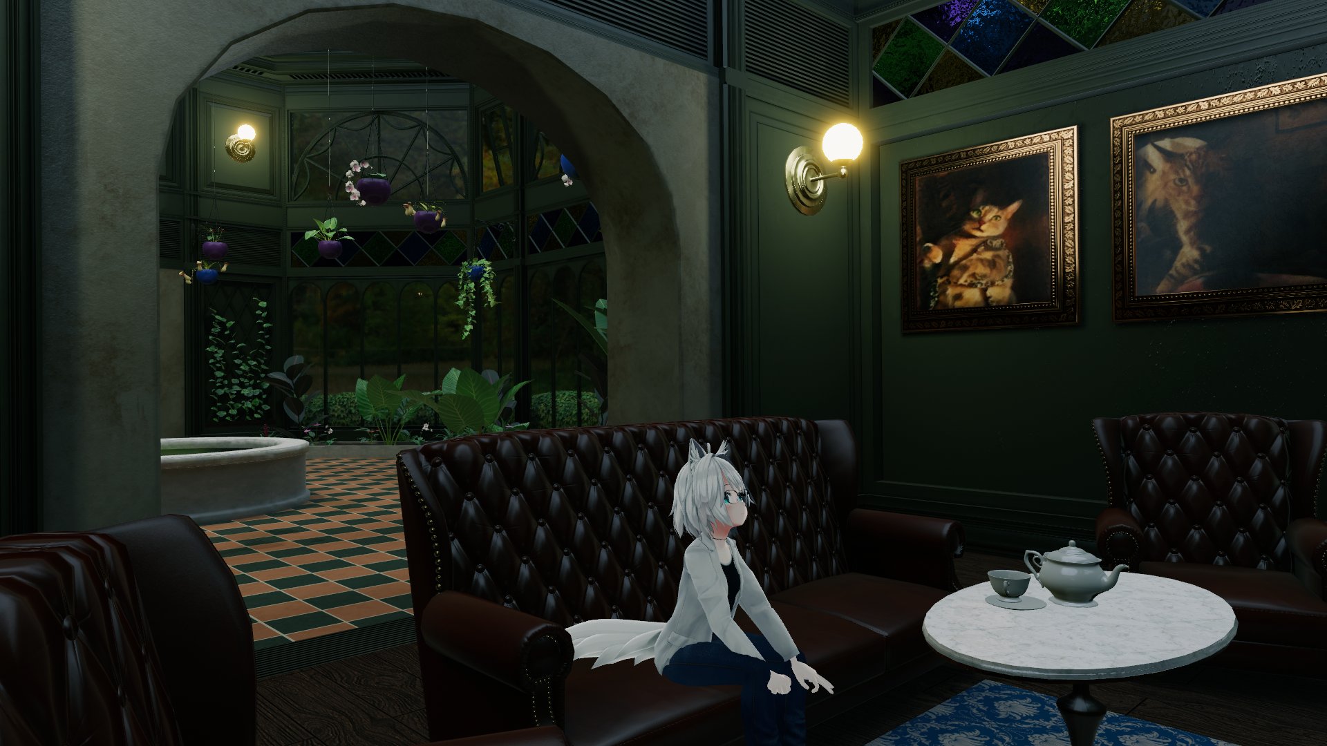
I mentioned this in my previous post about the rain shader developed for this world, but VRChat was chosen as the medium for this project because it’s a relatively easy way for anyone to just jump in and see the place, and because it provides a space for people to experience it together. One of the most fun parts about completing this project has been watching how people interact with the space and share it; it’s like watching people milling about in your own art gallery. It’s really gratifying to see people just sitting around and enjoying the scenery. Here’s some photos that users on Twitter shared of themselves and their friends hanging out:

Like I mentioned in the previous post, my experience with real-time graphics is a bit limited, and I’m also not a great modeler by any stretch of the imagination, so constructing this took several iterations and rebuilds while I figured out what would work and what wouldn’t within the confines of Unity Engine and VRChat. I have no doubt that there’s better ways to accomplish many parts of this environment than what I’d settled on, and if you’re one of those smart people that knows better, I would love to hear about it! I feel like I’ve learned a lot either way, but it’s great to hear advice from people who are much deeper into real-time graphics than I am.
Main Architecture
There’s not a ton that I can say about the construction of the architecture itself, other than that it took me a long time because I’m a lousy modeler and Victorian architecture is not simple. The modeling overall was tossed back and forth between Maya and Houdini. I’d initially tried to model entirely in Houdini but found that it was getting in the way of what really needed to be a destructive modeling process, rather than a procedural one, up to a point. Houdini also is not very good at dealing with object hierarchies… it can be a real hassle to keep things separated via “name” attributes while working in a SOP network, as opposed to Maya’s outliner.
Once I had the architecture roughed out, I started building the main trim sheet to be used for texturing. This was a somewhat new concept for me, coming from commercials and film, but it’s a very clever and efficient way of texturing environments. It takes some planning to get right, but the payoff is well worth it… a good few trim sheets can texture entire environments with minimal use of materials.
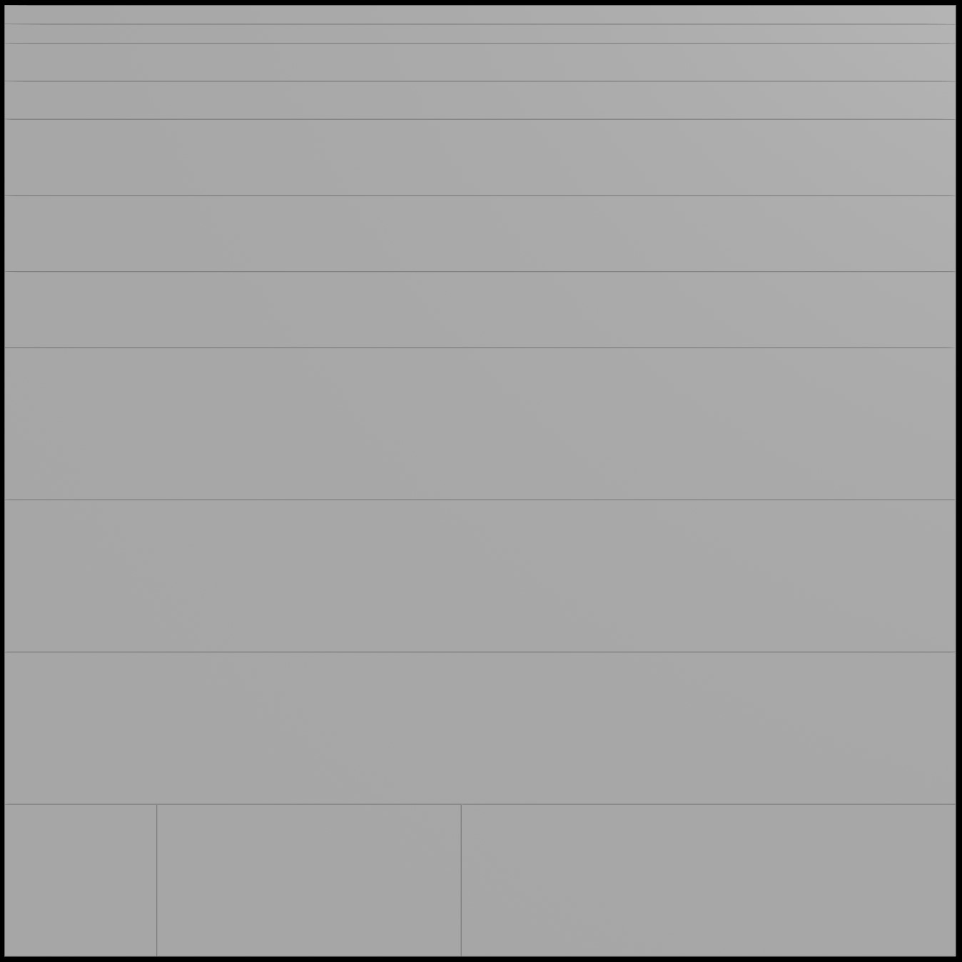
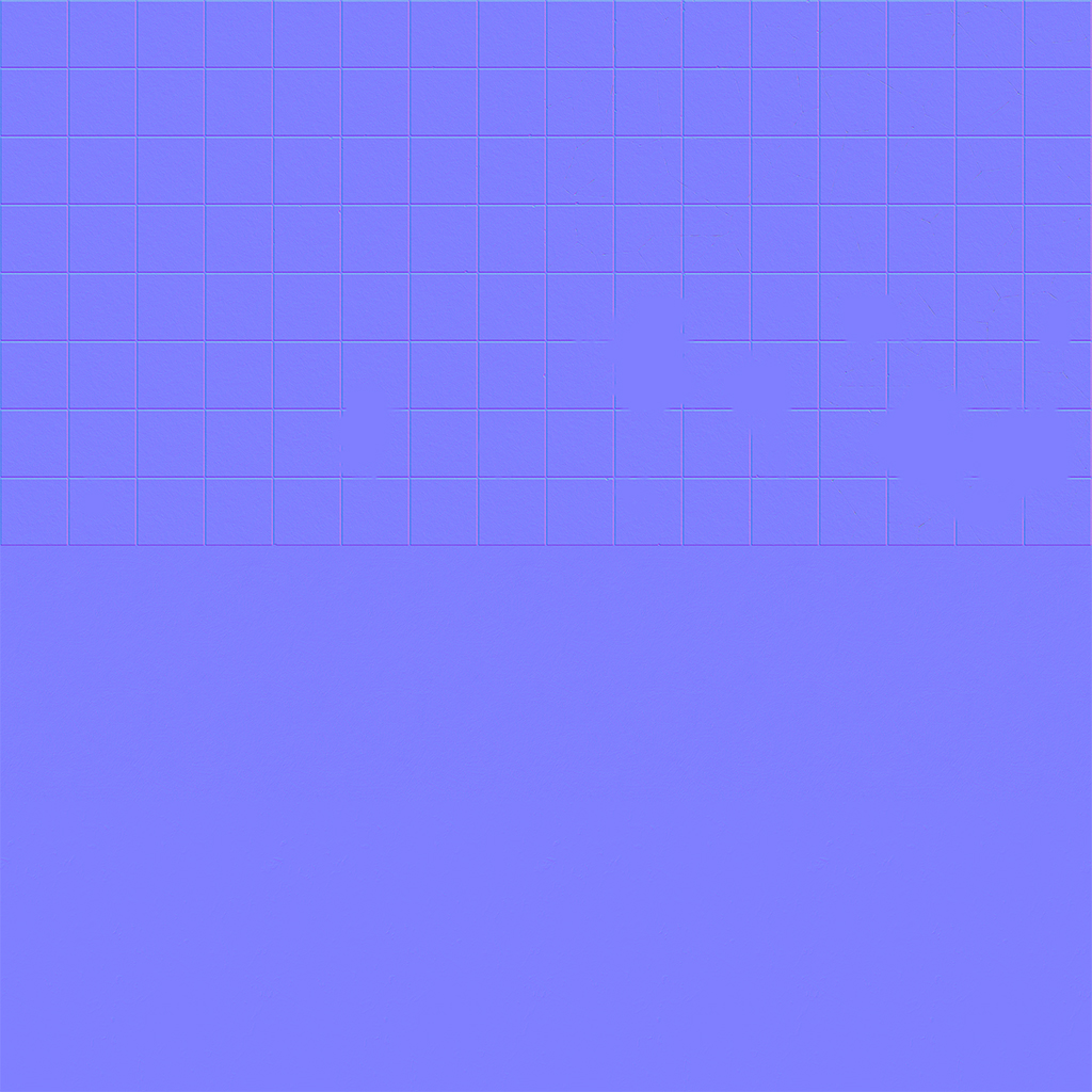
To create this, I first sliced up a grid to plot out the relative sizes of a bunch of decorative trims: crown molding, vents, bevels, and other design elements. The exact height of each trim is designed to be a specific percentage of a 1 unit grid: some trims might be 0.1 units tall, others might be 0.2 units, others 0.4, and so on. The idea behind each designated strip is that it’s fully tileable along the U axis of the trim sheet, so that it can keep being repeated as much as necessary to fill out the length of a given wall or other element. The height (V) of each strip is carefully chosen based on the expected relative height of the elements the trim will be applied to. For example, an elaborate crown molding trim would probably be much taller than a simple baseboard trim, and so it needs to take up more vertical space on the trim sheet. There’s a few specialized tiles at the bottom for special elements like vents and square decorative elements that aren’t meant to tile. Here’s what that sliced-up grid looks like:
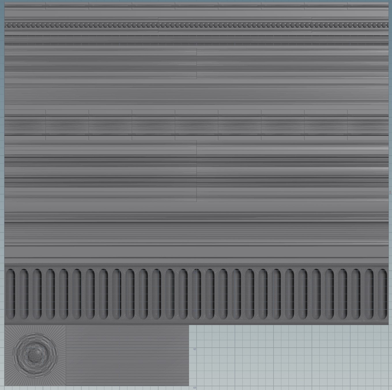
Next, I modeled a bunch of molding, bevels, decorative elements, and so on, to the dimensions specified by the trim sheet. Once I had each element built out individually, I just used the Match Size SOP in Houdini to place each element so that it fit into the exact dimensions (aside from depth) of each section of the grid. That finished geometry looked like this:
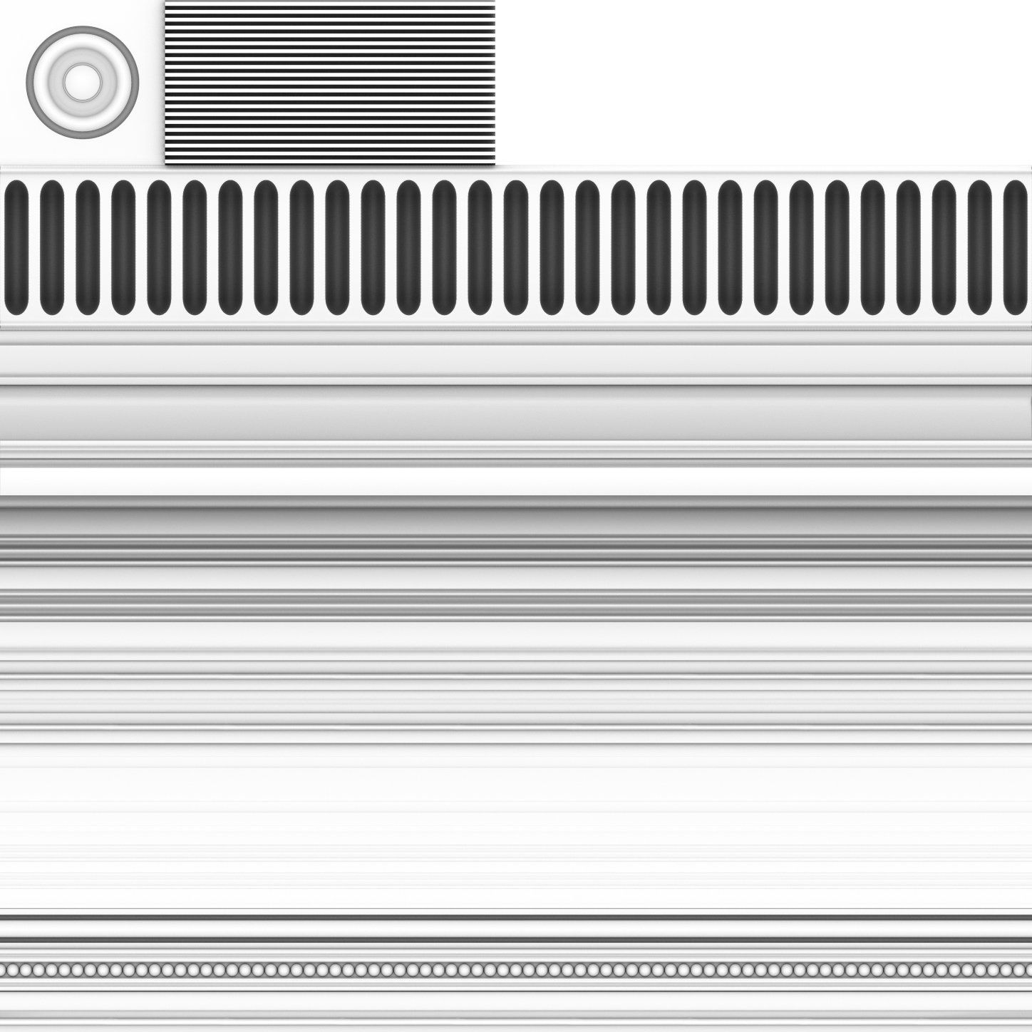
Both the sliced grid and the modeled geometry were exported to Substance Painter, and the geometry was baked down into normal and occlusion maps for the grid. I added a bunch of fine detail after the fact; slight bumps and imperfections, little scratches, and other evidence of wear and tear that help the place feel a little more “lived-in”. The final texture maps look like this:
ambientOcclusion 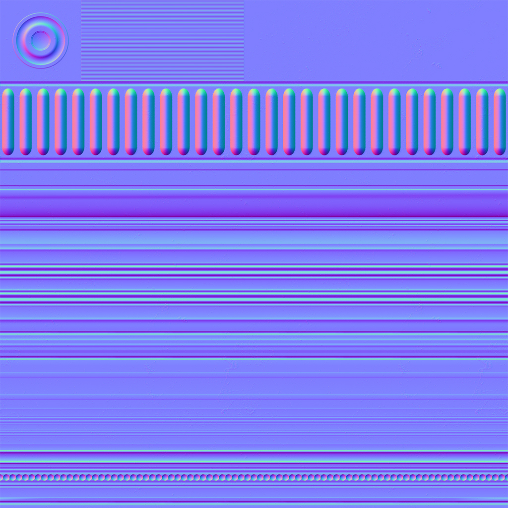
normal 
roughness 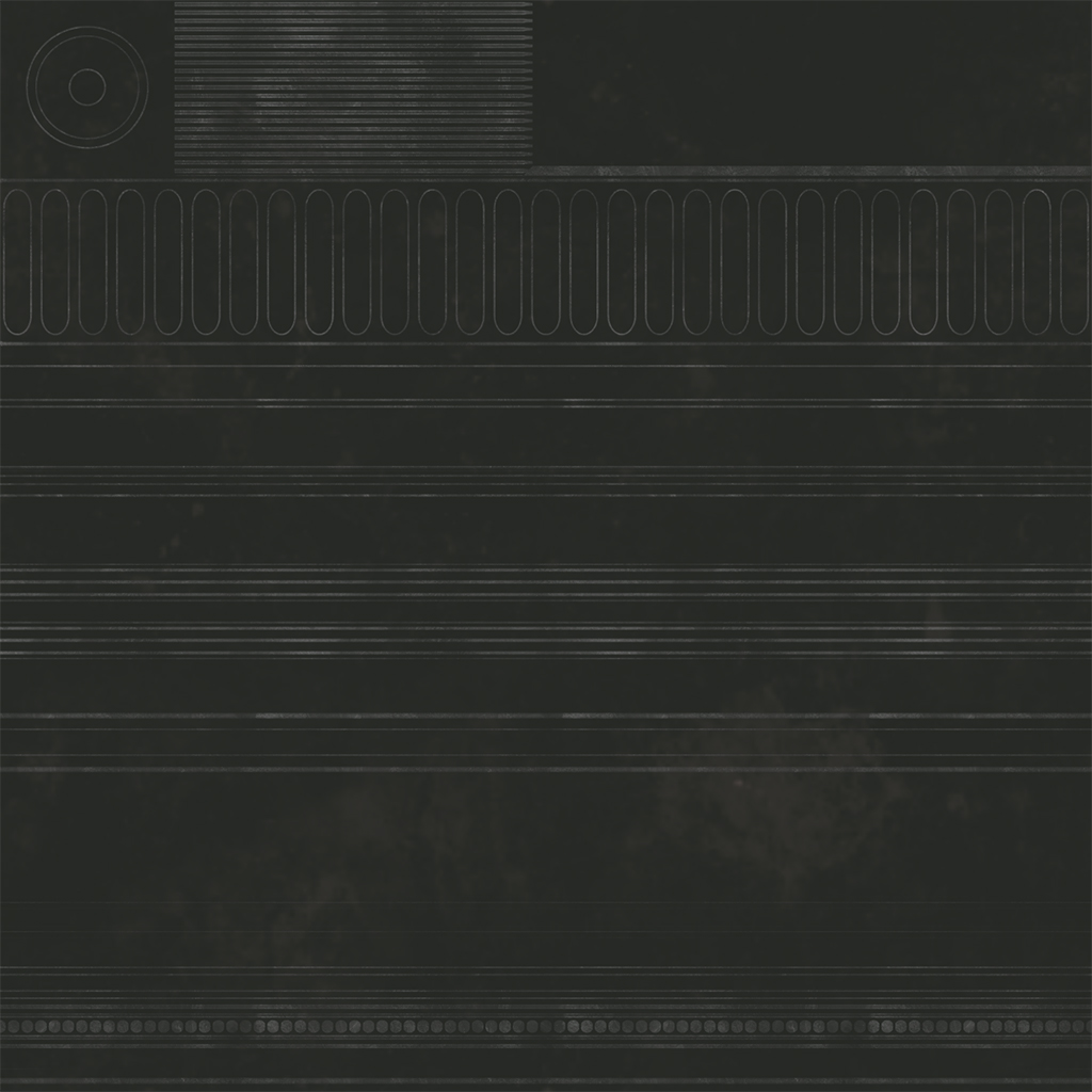
baseColor
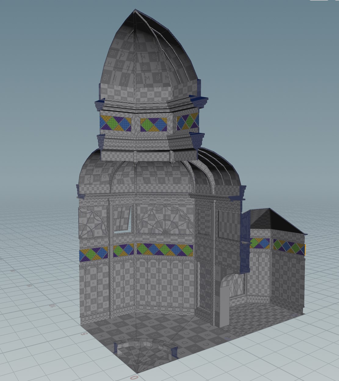
With the trim sheet in place, the next step was to actually lay out UVs. The central rotunda is symmetrical across both X and Z, and so once I built up a corner of the rotunda in Maya, I imported it into Houdini and handled the rest from there. The majority of the texturing here was handled via Houdini’s Labs Trim Texture tools. These nodes can be a little fiddly to work with, but when they work, they’re incredibly useful in assigning UV coordinates to the various faces of the architecture. You more or less just pick a trim from the trim sheet, then drop it onto faces or strips of faces on the architecture itself, and it automatically aligns the texture to the height of the face. Then you just scale the width to taste. This workflow lets you texture large environments quickly, and because you’re reusing the same elements over and over again, it’s dirt cheap to the engine. Here’s what one corner looked like with the initial UVs assigned from the trim sheets:
An important little workflow thing to note here: because Houdini is reading in every object here as a single “blob” of geometry, it’s really important to separate objects while working on them. Again, Maya is simpler about this than Houdini: each object is already its own thing with its own transform, but that’s not how Houdini thinks unless you build an object hierarchy when importing an FBX or Alembic, and that comes with its own nasty UX problems. Most geometry operations in Houdini, unless you’re very proactive about your procedural workflow, are highly dependent on point or primitive or vertex numbers to know what you’re operating on. If all of the architecture is a single stream, all you have to do is fuse a single vertex somewhere in an object across the map, and suddenly every downstream operation falls apart. To avoid this, use the Blast or Split SOP to isolate the object you want to work on by name, make your changes, then merge it back into the rest of the flow.
After this layout was done, the geometry was mirrored along X and Z, and the UV seams along the mirror edges were cleaned up a bit. Here’s what those trim sheets look like in the engine:
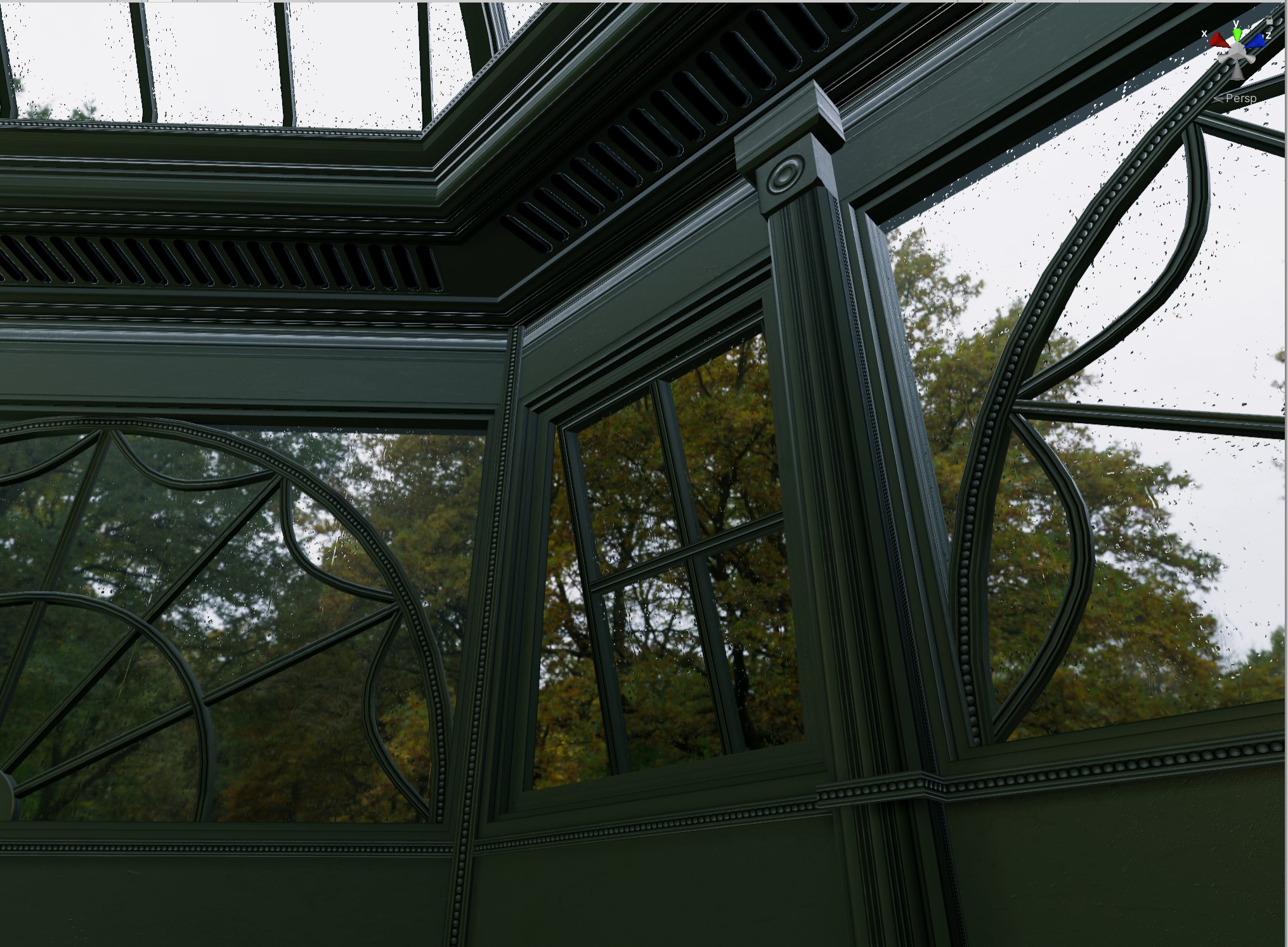
That’s a huge chunk of the environment textured with just a single material.
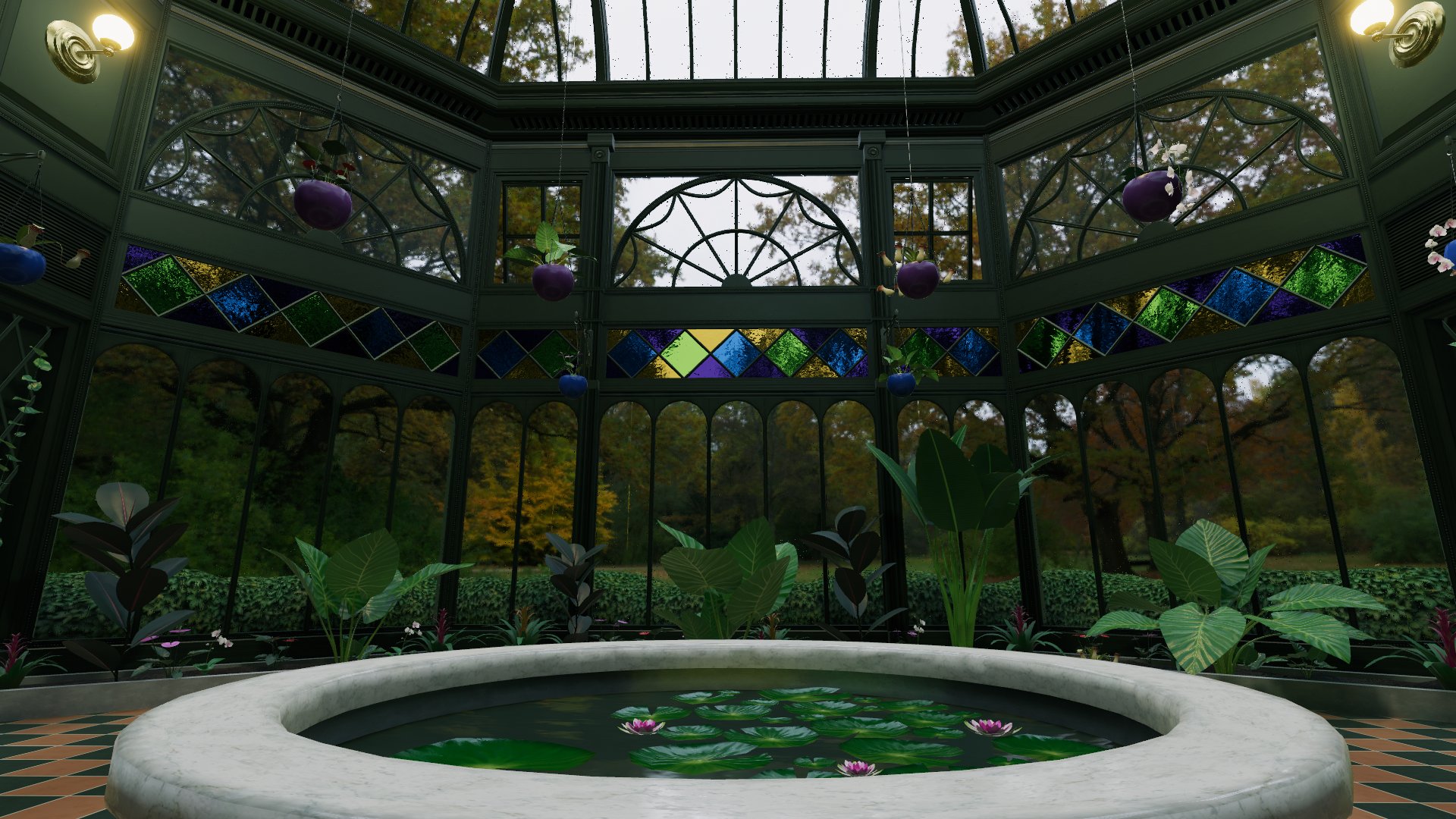
Floors and Fountain
The other major elements making up the architecture (aside from the glass windows) are the floors and the central fountain. The wood floors in either wing of the building are done using a single simple tiled texture; I got lazy and didn’t want to get weird with trims there, and the wood floor texture was detailed enough to warrant its use as its own material. The fountain’s stone and marble textures, and especially the floor tiles texture, were much more interesting.
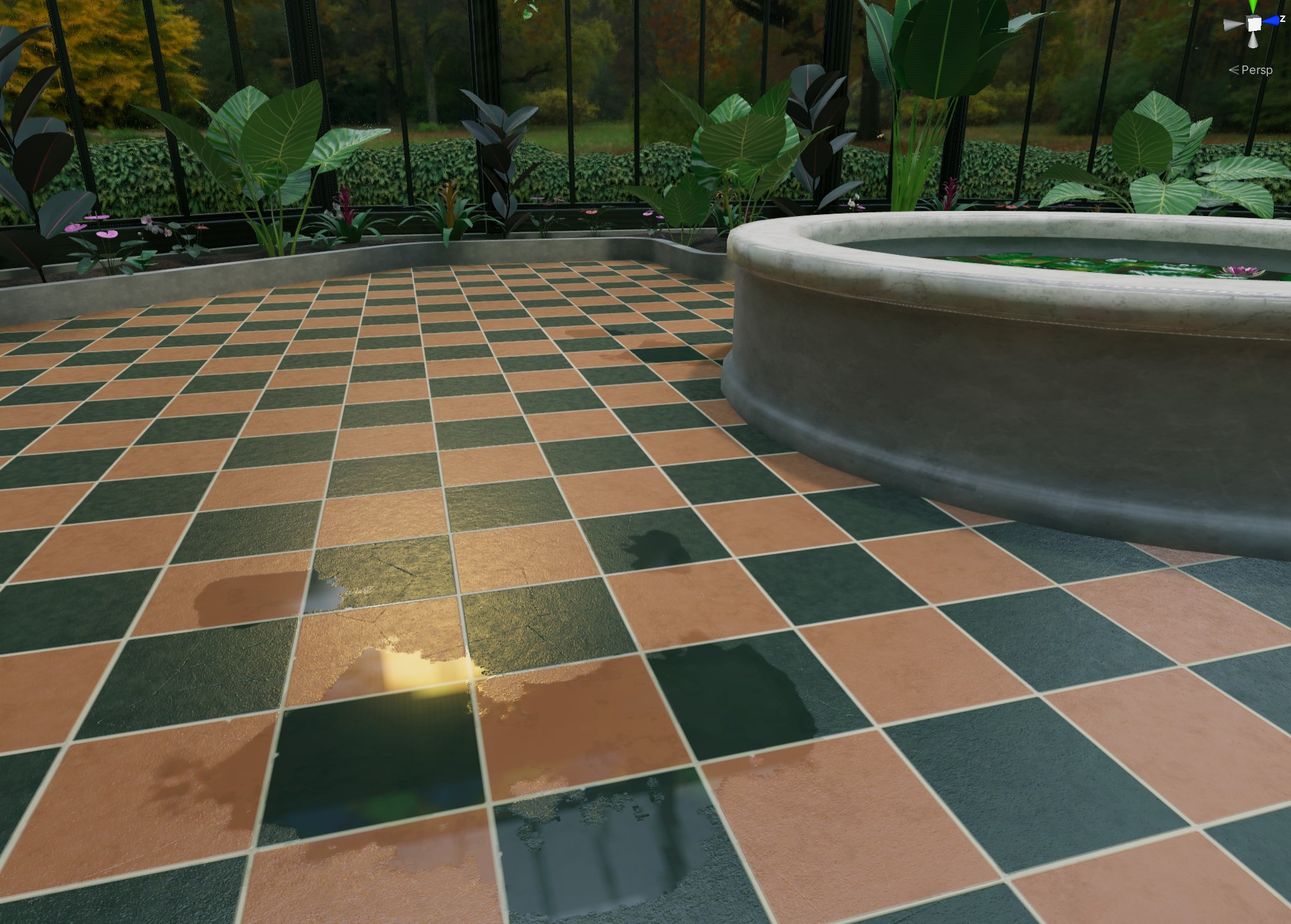
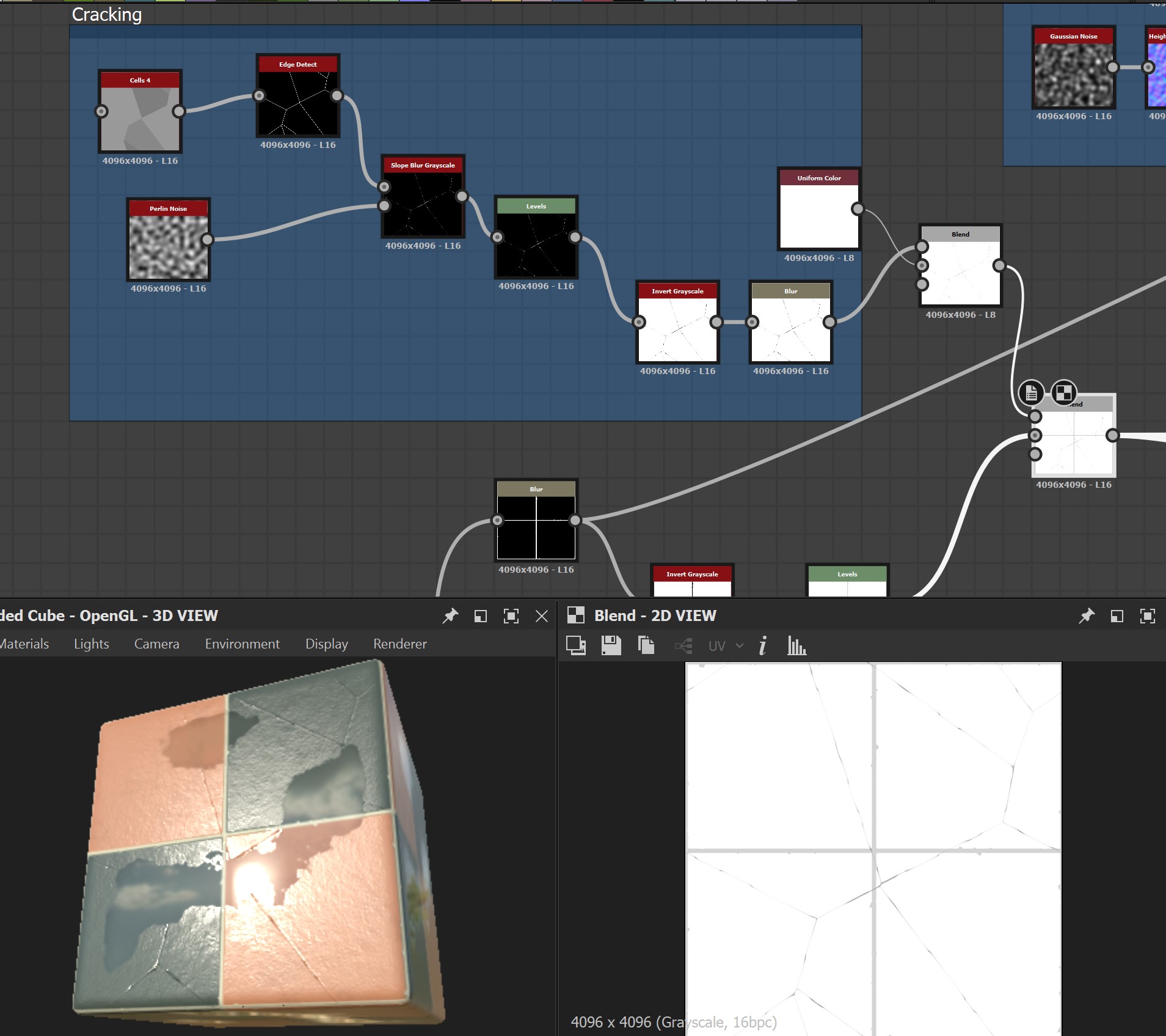
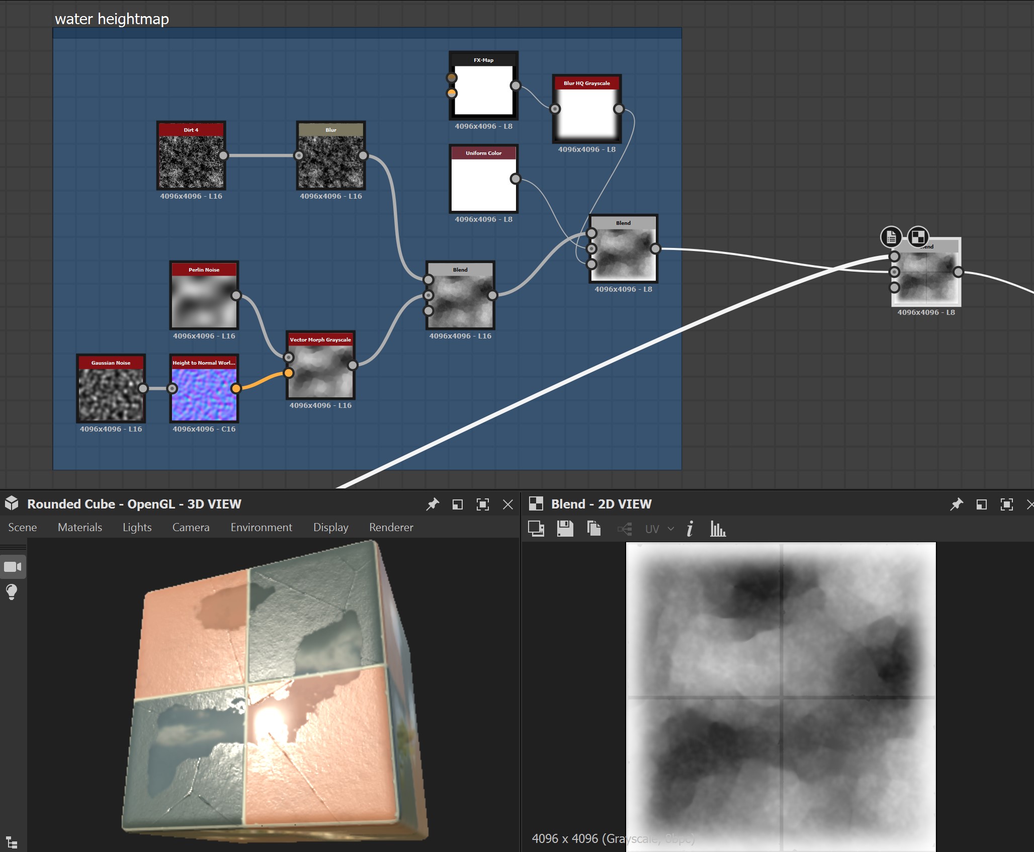
The stone and marble textures, used on the fountain as well as the large stone planters and marble tabletops, are simple trims built in Substance Designer that aren’t really worth going into detail here. The central floor tiles themselves are based on a single Substance Designer graph that procedurally builds a number of different tile variants that are then sliced up into the final trim sheet. This graph can apply all kinds of interesting modifications to the base tile pattern, including cracking, chipping, and puddles, all with a few parametric controls that drive these effects using simple tricks like noise functions to drive the height map, and that height map drives almost everything else. Eight copies of this graph were then loaded into the main trim sheet graph along with the marble and stone textures, with each copy having hand-picked settings to get a good variety of tiles with different amounts of damage and wetness.
Substance Designer is a pretty deep rabbit hole to find yourself in, and I’m still only an intermediate user, but the principles of working with it will seem pretty familiar to most people who have used a node-based interface before. Build up a network of operators, decide which parameters you want the user to control, and promote them to a top-level interface that the end user can drive easily. It’s a lot like HDAs in Houdini, but with a way worse interface for wiring up expressions.
For example, the tile chipping is just scattering a couple of simple polygonal shapes randomly, then using the result to drive a Slope Blur that expands the grout pattern. The “Chipping Amount” parameter at the top level is just driving the “Mask Random” parameter on the Shape Splatter node.
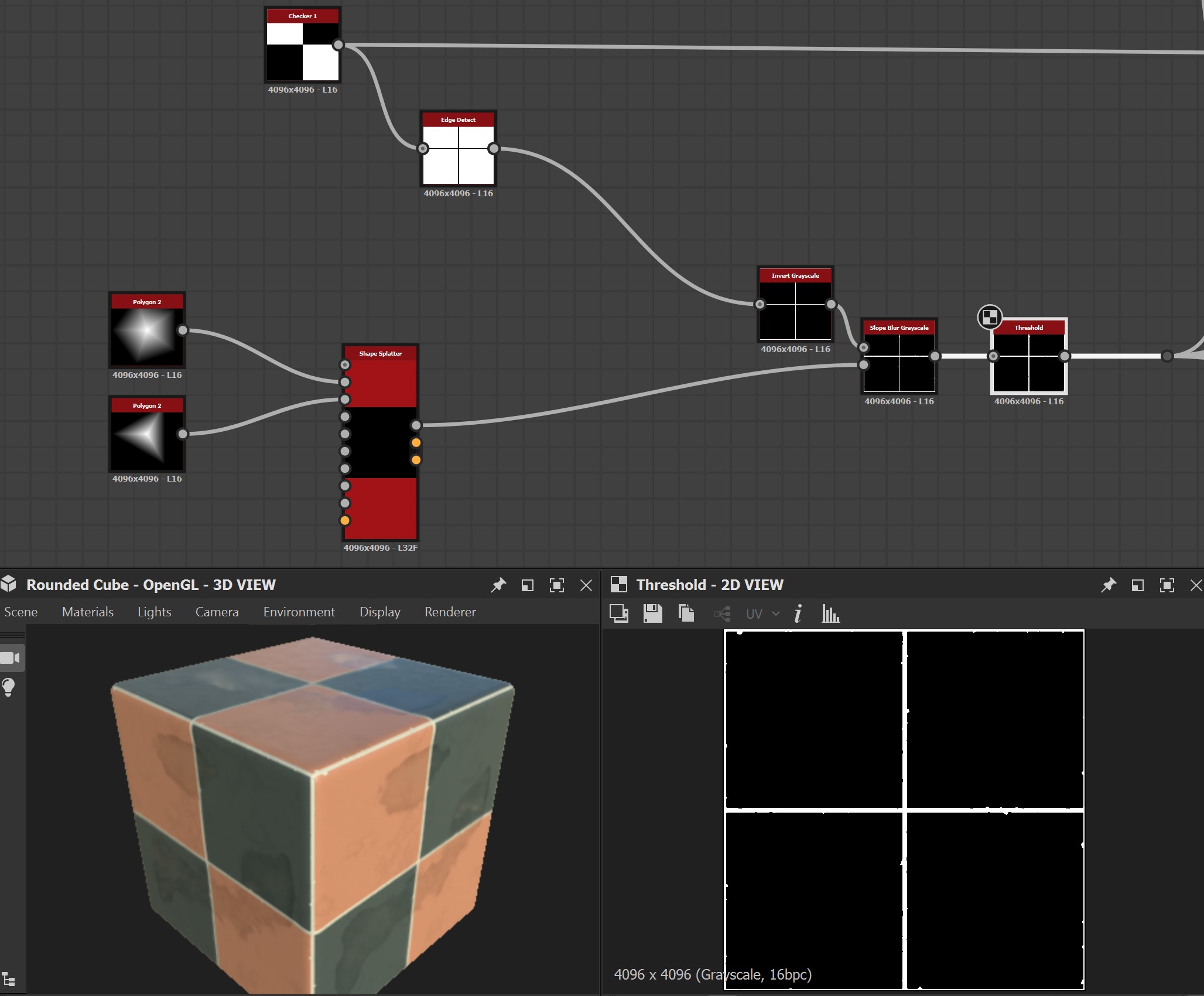
The cracks are essentially just Voronoi noise (“Cells” in Substance), distorted with a higher frequency Perlin noise to break up the pattern. The scale of the pattern, the amount of distortion, and the overall opacity of the cracks are all parameterized. All of these effects so far are just effecting the height map, which is later used to drive the appearance of everything else downstream: the cracking, the water height, and so on. Substance Designer seems to work best when you build everything up from a heightmap and then use those values as masks to drive the rest of the material.
The texture driving the water puddles is pretty much just a bunch of layered-up noises that will eventually be run through a cutoff filter in the Water Level node. Layering up noises like this ensures that the water will have an overall cohesive pattern, but with small drippy splatters around it. The white blurred mask on the outside ensures that no puddles will go across a given tile, since that would break the illusion.
Here’s what the textures look like. You can see that effects like the puddles on the ground are just handled with textures alone; slightly darkening the albedo and setting the roughness to zero is enough to make certain parts look like they’re wet, with no decals or other materials involved at all. These eight different tile variants are then applied to square faces that make up the ground plane in the center.
normal 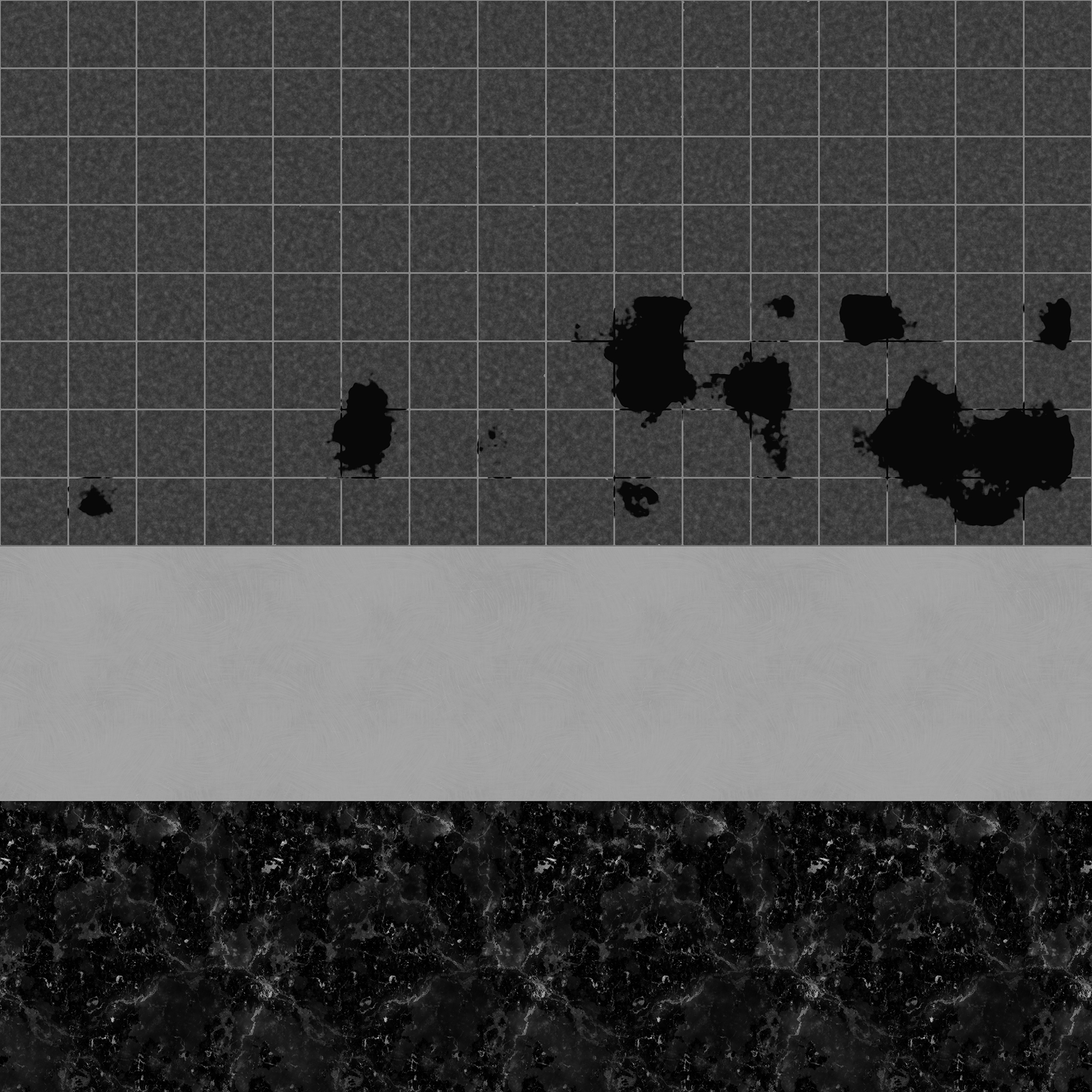
roughness 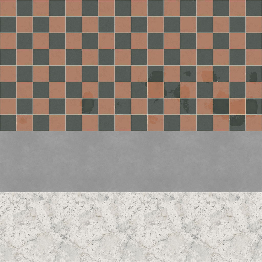
baseColor
Fake Transparency
Of all the shaders in this world, I definitely spent the most time on the rainy glass shader mentioned in the previous article. Surprisingly, though, the colorful stained glass that lines the building probably got the most vocal response from anyone I spoke to in VRChat. It’s a really simple little effect!

I’m still not good enough at writing shaders in Shaderlab or HLSL to do them myself, but I understand what I need well enough to at least handle them through nodes. Using Amplify Shader Editor (again), I wrote a quick little shader to handle the stained glass effect. In short, all it’s really doing is looking up the skybox texture and distorting the lookup position slightly via a normal map, then returning the resulting texture, multiplied by the vertex color of each pane to tint it. The most relevant part of the shader network is this:
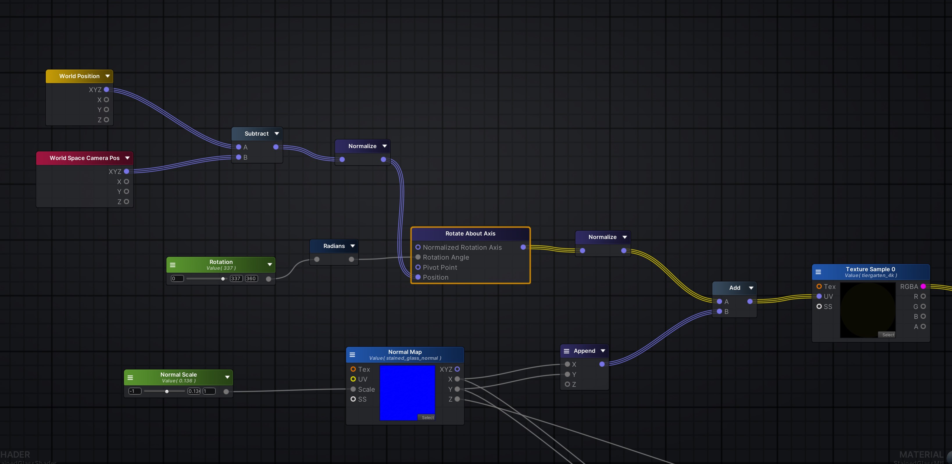
I’m comparing the position of the camera (in world space) to the world position of the given fragment being rendered, and getting the normalized vector between them… this is the “ray” that’s pointing to the coordinates of the skybox texture I want to sample. I then take that ray and rotate it around the world Y axis by the same rotation value as the actual skybox, so that the coordinates line up with the skybox rotation I already have in the scene.
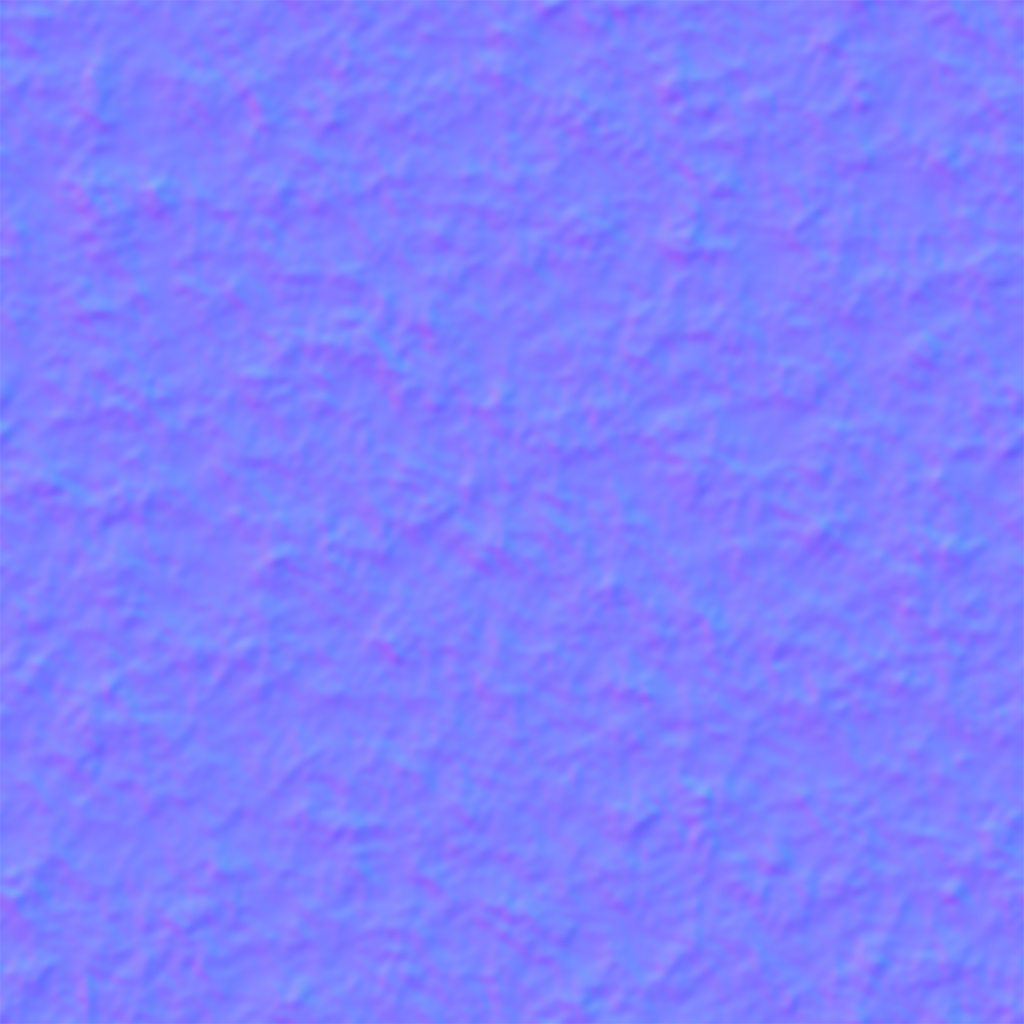
The normal map’s R and G values, generated from simple noise in Substance Designer, are then added to the lookup coordinates of the skybox map. This distorts the ray to create the fake refraction effect.
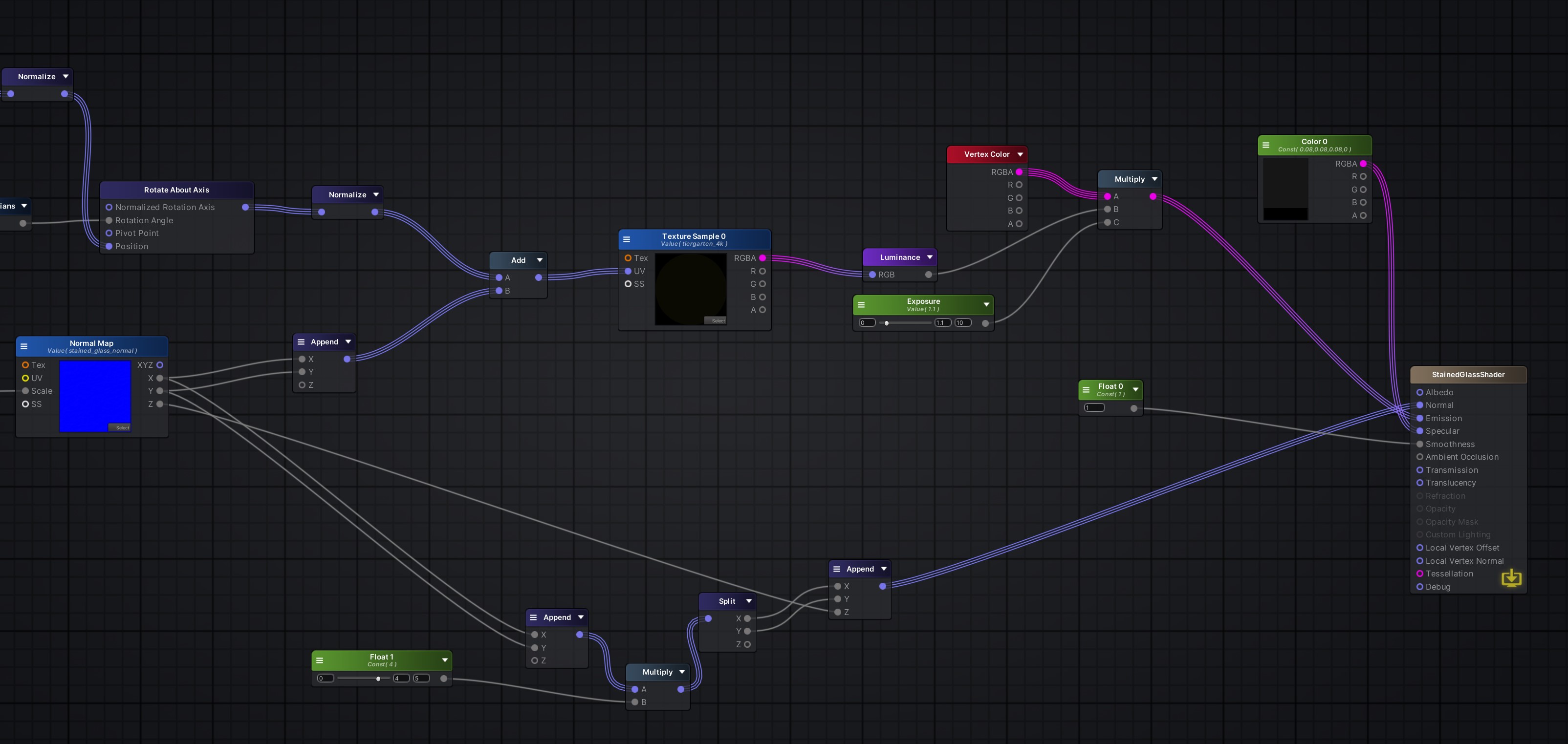
The resulting sampled skybox value is converted to grayscale and then multiplied by vertex color and an “exposure” value (really just a scalar) so that the brightness of the glass can be tweaked. That’s really it! Everything else is just taking that same normal map and scaling it a bit so that it affects specular reflections as well, making them slightly bumpy. There’s no actual transparency or anything here, it’s just a simple texture lookup, so the effect is very cheap and works well on any platform.
The shader applied to the falling raindrop particles outside (not the ones on the glass) operates on the same principle. Look up the same skybox texture but offset by about a degree of rotation, multiply the result by an exposure value, and return the result. The raindrop particles themselves are just long, flat rectangles with that shader applied. They look transparent, but they’re not! Cheap, dirty tricks. Transparency is expensive in real-time, one of the most performance-impacting things you can do, so everything in this world is designed to minimize the use of transparency (except for that rainy glass texture!) wherever possible. Little things like this add up!
Coming up next: plants!
In the next article, I’ll talk about how the various plants were generated using Houdini. Hope this was useful for some of you! Please have a look around The Conservatory to see all of this stuff in context!
1 Comment
The VR Guy · 04/24/2026 at 08:18
Love the trim sheet workflow. Really clever approach for VR optimization.